Written by Faith Karimi, CNN
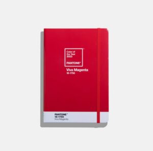
The global color authority reveals its Color of the Year every December, and its 2023 choice, announced Thursday, is a vibrant relative of the red family.
Described as “a nuanced crimson tone” that balances warm and cool, Viva Magenta is “an unconventional shade for an unconventional time,” Pantone said in a statement unveiling its pick.
“Brave and fearless, (Viva Magenta) is a pulsating color whose exuberance promotes optimism and joy,” the statement added. “Powerful and empowering, it is an animated red that encourages experimentation and self-expression without restraint; an electrifying, boundaryless shade.”
The company went on to describe the color as “audacious, witty and inclusive of all.”
The Pantone Color Institute’s choice is intended to reflect the latest trends across sectors including fashion, beauty, technology, design and home decor. It also serves as something of a mood ring, with shades chosen to capture the zeitgeist.

In years characterized by uncertainty, this has often meant colors that soothe, calm or uplift. Amid the ongoing pandemic, Viva Magenta represents reassurance, confidence and connection in a world trying to get back on its feet, according to Laurie Pressman, vice president of the Pantone Color Institute.
“We are living in quite the unconventional time. The only thing that has become conventional is the unconventionality of it,” she told CNN during a video call. “While there have been so many things that have played into our thinking, so many things that have influenced and impacted what’s taken place and the changes we’ve had to make, there’s no doubt that the overriding influence has been Covid.”
Inspired by nature
Leatrice Eiseman, executive director of the Pantone Color Institute, said the hue was inspired by the natural red dye derived from small insects called cochineals.
“As virtual worlds become a more prominent part of our daily lives, we look to draw inspiration from nature and what is real,” Eiseman said in a press statement, adding: ” Rooted in the primordial, Viva Magenta reconnects us to original matter. Invoking the forces of nature, it galvanizes our spirit, helping us to build our inner strength.”

This year’s announcement is accompanied by a new Miami exhibition that opens to the public Saturday. Dubbed the “Magentaverse,” it explores the “dynamic between Artificial Intelligence and human creativity” through interactive rooms featuring visual, auditory and tactile experiences linked to Viva Magenta.
Color boost: How vivid hues in your home can lift your mood
Pantone is known for creating the Pantone Matching System, which is used to identify and match colors in industries such as printing, graphic design and fashion. It has named a color of the year annually for more than two decades.


